In 1975 there were two film posters on my bedroom wall. Both were for films released the previous year (Gold and The Odessa File) and both were typical of Seventies poster design in that the images were the work of artists rather than photographers. With some notable exceptions film posters today tend to be photo-shopped and airbrushed portraits of movie stars. In the Seventies they were works of art in their own right.
Amongst my growing library of film books was a large A2 ring bound volume, which was a visual history of the art from the days of silent pictures up to the late Sixties. Some of the most striking images in the book (Bonjour Tristesse, An Anatomy of a Murder) turned out to be the work of one man: Saul Bass. Bass enjoyed a long and distinguished career (both in poster and movie title sequence design), working with directors such as Alfred Hitchcock, Billy Wilder, Otto Preminger, and Martin Scorsese. He directed a single feature film himself (Phase IV), which was a cerebral entry into the popular Seventies nature-in-revolt genre (of which Jaws may be considered a distant cousin).
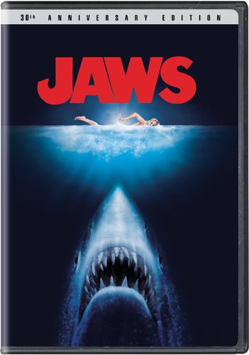
If Saul Bass is number one in my personal top ten of movie poster artists, the number two position has to go Roger Kastel. Bass gets the top spot for his body of work. Kastel, who built his reputation as an illustrator of western paperback covers, deserves his place for a single piece: the shark/swimmer image that spearheaded the Jaws promotional campaign.
Kastel was originally commissioned by Bantam Books to do the cover of the paperback version of Benchley's novel, based on the almost abstract image that appeared on the book's hardcover edition. Universal Pictures were impressed enough with his work to buy the rights to it, and over the years it has assumed the power of a corporate logo.
What is it about this particular image - and this particular interpretation of it - that resonates with the zeitgeist?
The simple Freudian explanation is that the image embodies our fear of the id, the unknown terror of the subconscious that threatens our everyday normality. It is, in a sense, a cross-section of the human psyche: above, the calm surface, and below, the primitive urge. There is, too, an undeniable sexual subtext. The rising head of the shark is a phallic symbol - although the pointed snout of Kastel's fish is considerably less priapic that the snub-nosed original dust jacket version. The swimmer's nakedness is teasingly veiled by the disturbed water around her, but there is a hint of an erect nipple and the shadow of pudenda.
Kastel paints both shark and swimmer in photo-realistic detail whilst at the same time allowing himself some artistic licence.
Above the water the woman's hair is flattened to her head with one slick lock falling over her right eye. Below the surface the hair (which is a reddish blonde) floats freely in the element. The right arm is arched behind the woman's back as she is caught in mid-stroke and there is an elegance about the posture that recalls the classical statues of antiquity. Though visually pleasing, the position of the arm seems wrong when compared to the real thing. Go to Google Images and type in 'woman swimming crawl' and almost every shot will show that the arm is bent more like a V at the elbow. The woman's eyes are closed - as they would be to keep out the stinging salt water - and her expression calm. She is completely unaware of the thing rising towards her from the deep.
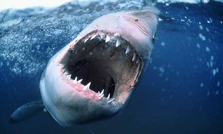
Although the shark itself is painted in realistic detail, it does not seem to be anatomically correct when compared to photographs, in particular, the down-turned crescent of the jaws. The teeth are layered in rows and convincingly irregular, though their shape is more elongated that a normal Great White's. Here Kastel seems to have taken his cue from a sentence in Benchley's novel, where the shark is described as being like "a locomotive with a mouth full of butcher knives." The teeth in the poster even seem to have a metallic sheen to them. The shark's head is not quite symmetrical, with the right eye raised slightly more than the left. If you flip the image or look at it in a mirror, this natural irregularity seems even more pronounced. The speed at which the shark is rising is conveyed by the bubbles on either side of its jaws, and again the artist appears to favour the right with a greater sense of commotion. The head has a sleek torpedo-like shape to it, and seems closer to the shark that attacks the estuary victim than the chubbier version of the final act.
Perhaps the most disturbing aspect of the image is the distorted sense of proportion. The shark appears monstrous in comparison to the woman, suggesting that we are not supposed to read this as a literal representation of the attack. And yet the two creatures - predator and prey - occupy the same watery element, and it seems as if we are witnessing the split-second before the shark strikes.
The colour palette is dominated by blues and greens, and within this cold environment the swimmer's tanned skin looks exposed and defenceless.
There is a pleasing geometrical symmetry to the picture. The swimmer, moving from left to right as your own eyes move along this text, is in the exact centre. This horizontal plane is contrasted with the vertical movement of the shark, the tip of whose snout is aimed directly at the woman's midriff. Three quarters of the image is water and above it a white blank onto which is stamped the film's title in bold red capital letters, the edges of the A and the W neatly dovetailing. The film poster was usually in a standard portrait format, but the image was equally striking in both landscape and sidebar. I remember The Sunday Express, which in those days was a broadsheet newspaper, running a two column version of the poster that occupied the full length of one page. Even with the sea from the sides of the image cropped the shark and swimmer were balanced in perfect harmony.
So effective is Kastel's interpretation that it is difficult to fathom why it has recently been tinkered with. The cover of my 2 disc DVD has an embossed updated version, which has little of the power of the original. The water is darker and the shape of the shark, which seems to be glowing with phosphorescence, is partly obscured by the rushing water at its flanks. The swimmer's wrist is no longer cocked and, although the movement of her arm looks more natural, it also looks less elegant. Any hint of nudity has been airbrushed away and obscured by glowing bubbles. The woman's hair has been lightened to a dusty blonde.
Just as companies insist on refreshing their logos, so Universal Studios seems to think that the image that identifies one of their most enduring films needed to change with the times. In fixing something that wasn't broken in the first place, they have failed to recognise one of the qualities of Roger Kastel's work: its timelessness.